When to use padding and margins
Problem
Often, when positioning elements with CSS, there is no visible difference between using padding and margins. However, when it comes to writing maintainable CSS the difference is quite important. It can be quite painful to come back to some CSS a long time after it was first written wanting to add some background colours or borders and realise padding should have been used instead of margins or vice versa.
Solution
To avoid these situations, try adding a background colour each time you introduce a new element to a web page. If it looks like everything fits together, then padding is your solution. If it looks like the colour is bumping up against surrounding elements in a way that it shouldn’t, then perhaps using margins is the way to go for this scenario.
It’s just a rule-of-thumb, but a minute of consideration with this little experiment can save a lot of time in CSS maintenance later on.
Example
Here is an example show how this process helps. Let’s say we’re introducing images which should float to the right of some of our articles (one of the valid uses of the float property). We want a buffer around this image to separate it from the text. Should we use margins or padding? For argument’s sake, let’s try padding first.
First attempt

This is some random text that is just here as part of an example. Some short words and hyphens are needed here. We want the text to get as close as possible to the image to demonstrate the effect. This text should also be long enough so that an image floating to the right looks reasonable. This example emulates a design pattern commonly found on Wikipedia where an information box or image floats on the right-hand side of the article or text snippet.
Hmm, that makes the image look unbalanced. Let’s try again using margins to separate the image from the text instead.
Second attempt

This is some random text that is just here as part of an example. Some short words and hyphens are needed here. We want the text to get as close as possible to the image to demonstrate the effect. This text should also be long enough so that an image floating to the right looks reasonable. This example emulates a design pattern commonly found on Wikipedia where an information box or image floats on the right-hand side of the article or text snippet.
That’s better. The image is centred within the background colour and margin providing the buffer around the image no longer runs up against the text. To finish, let’s drop the hyphenation and background colour to see how this really looks.
Clean up

This is some random text that is just here as part of an example. Some short words and hyphens are needed here. We want the text to get as close as possible to the image to demonstrate the effect. This text should also be long enough so that an image floating to the right looks reasonable. This example emulates a design pattern commonly found on Wikipedia where an information box or image floats on the right-hand side of the article or text snippet.
In the real world
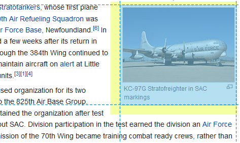
The example text says that this is float-an-image-to-the-right design pattern is common on Wikipedia. Let’s have a look at an example:

Here is an image box, floated to the right and buffered with margins. Even better, padding is used to frame the image in the image box. Using the dev tools, it is obvious that the area highlight yellow would seem unbalanced with a background colour. The area in blue could have any background colour and therefore benefits from padding.